For my preliminary task, i am to create a school magazine front cover and contents page. In preperation to create my own product, it is necessary for me to explore and research already existing school magazine products to enable me to understand the typical conventions.
Throughout this task, i will choose a target audience in which i feel my product should be aimed at, and ensuring both my front cover and contents page are suitable.
As well as focussing on what target audience my school magazine will be aimed at, i will need to find a specific theme for my product to promote. This will allow me to find my niche target audience whom would appreciate the magazine more.
I am aware that when i have finished the creation of my front cover and contents page, i will need to receive feedback. I will explore the best possible ways in which i can get constuctive criticsm.
Saturday, 9 April 2011
Research upon school magazines
School Magazine front covers

Typically, the main images are placed centrally within the page. This seems neat and tidy. It also allows its audience to be enticed to the magazine. He presentation of the images is well fitted to its audience, that is, the students of the school. With their tilted positioning, and ripped effect around the edge, it avoids looking untidy, even asserts itself with its target audience. The images use bright colours, allowing them to stand out greatly against the background.
Moreover, the title of the magazine is placed at the top and central of the page, finding symmetry between itself and the main images used. It also finds a sense of fluency within the cover, again using the rough-edged effect.
The magazine firmly asserts itself as that of a school one, with the use of the school logo, placed underneath the images. Again, its placement is deliberate and fitting to the rest of the magazine. Additionally, the clever use of lined paper in the background is indeed appropriate for the nature of the magazine.
The magazine is clearly a yearly issued one. The date at the bottom right hand corner confirms this.
One criticism, however, is the lack of additional information on what is included within the magazine. It is very blunt in this sense, and will perhaps alienate some students.
Overall, I feel that the magazine is successful in asserting itself as a school one. It’s neat, crisp presentation is certainly attractive, as is the enticing colourful images used. The use of centralising the important aspects of the magazine attracts the audience to view the key features. Although the magazine doesn’t contain additional information, it does allow it to seem more fresh and less cluttered. Overall, I feel that this magazine is a successful one, with little to be criticised.

I am going to analyse the front cover of the Ruthinian achool magazine, 2008
An important thing to recognise within the front cover is the fact that there is no white. This prevents the product from appearing boring. It is successful in using bold colours to attract the attention if the students.
Moreover, the magazine cover anchors itself with the inclusion of the school logo placed centrally on the upper half of the page. This allows its audience to familiarise and link the magazine to the school without much concentration.
Another way in which the magazine asserts itse;f with the school is with the use of the school colours covering the entirety of the background of the page.
The use of pale colour for both the text and the logo is rather fitting to the magazine. It stands out greatly amongst the bold colours in the background, and is successful in notcluttering the page.
The magazine is clearly issued yearly. This is confirmed by the year date plaved centrally at the bottom of the product.
The overall presentation finds much symmetry and fluency.The placement of text and logo is greatly appropriate, brining about a sense of organisation and formality.
However, the magazine does not contain certain typical conventions in which are found in many other school magazines. Such include the lack of images. Though it holds a logo, the cover has no attracting image to entice the audience. Moreover, informative text is not placed on the cover. This, again is not very appealing.
Overall, I feel that the magazine finds ambigurity in terms of the colour scheme. Ye, it is certainly enticing and attracting to the audience, however, it is also used to promote the school colours, fully asserting itself as a school magazine. Moreover, the presentation is very neat and deliberate. Two criticisms of the magazine are the lack of images, and informative text telling the reader what is in the contents of the magazine.


This magazine is clearly aimed at the parents of young pupils.
Typically, there is a main image placed central to the page and covering almost the entirety of the front cover. This image anchors the school’s students, depicting young pupils. This allows us to understand that the school educates younger children. The frame is of a medium-long shot of four young pupils.
This point is echoed within the title ‘Prep-school’. This title is largely attractive, contrasting greatly from the red background of the head-mast.
The magazine has kept to a fluent colour scheme of red and white, both mature colours, enticing the parents of the pupils.
The use of white text is largely efficient, as it is easy for the audience to read.
The magazine contains informative text, briefly mentioning the contents of the magazine. This is appropriate as it, like many magazine covers, allows the audience to understand immediately what will be in the magazine.
The magazine’s colour and presentation is deliberate in addressing its target audience. By using mature colours, and a neat presentation, it in no way patronises the audience with chaotic colours.
Overall, I feel that this magazine is a great example of a successful school magazine front cover. With the inclusion of a large, appropriate image, bold, attracting text, and a neat colour scheme, the magazine flows greatly, and more importantly, will entice the target audience, the parents.
Genre
For my school magazine, i have decided to create a performing arts one. This is because i myself have a great interest in media, and i have not seen a media influenced school magazine.This will allow me to distance my product from the typical, already-existing products, allowing me to explore and use more creativity.
The magazine will promote film media, drama, and art. I feel this will make the product much more intereseting, and will appeal to a wider audience, as it doesn't just persue a single topic, like art.
The magazine will promote film media, drama, and art. I feel this will make the product much more intereseting, and will appeal to a wider audience, as it doesn't just persue a single topic, like art.
Target audience
As my school mahgazine is influenced by media itself, i have explred my possible target audience in great depth and have come to a conclussion. As my magazine promotes media and performing arts, it gives me a wider target audience. This is because any student with an interest with either art, media, or drama will fint the magazine appealing, as opposed to remaining to just one of these topics.
I feel that my target audience will be the ages of 15-18, attracting both genders, who either study the topics, or find an interest in them. The reason for me deciding the 15-18 age group is because this is the age group for GCSE's and A level. I think people who are perhaps taking these subjects for GCSE and A level might find the magazine interesting, even helpful as it will inform them of upcoming events. Moreover, i believe this age group is mature. My magazine will be rather mature, yet, still maintaining a youthful, attractive image to the extent that they will want to read the magazine.
I feel that my target audience will be the ages of 15-18, attracting both genders, who either study the topics, or find an interest in them. The reason for me deciding the 15-18 age group is because this is the age group for GCSE's and A level. I think people who are perhaps taking these subjects for GCSE and A level might find the magazine interesting, even helpful as it will inform them of upcoming events. Moreover, i believe this age group is mature. My magazine will be rather mature, yet, still maintaining a youthful, attractive image to the extent that they will want to read the magazine.
Ideas for my school magazine
Possible titles
Before going on to the practical production of my school magazine, it is important for me to establish a title for the magazine. I have narrowed it down to six possibilities.
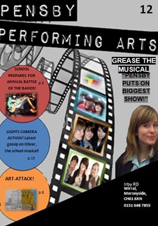
- Now Pensby - MFA (media film art)
-Pensby News - Pensby Weekly
-Pensby Performing arts - behind the scenes
After much concideration, i felt that 'Pensby Performing Arts' was much more appropriate for a film title than the other options... (might need to change)
-images
-title ideas
-fonts
Before going on to the practical production of my school magazine, it is important for me to establish a title for the magazine. I have narrowed it down to six possibilities.
- Now Pensby - MFA (media film art)
-Pensby News - Pensby Weekly
-Pensby Performing arts - behind the scenes
After much concideration, i felt that 'Pensby Performing Arts' was much more appropriate for a film title than the other options... (might need to change)
-images
-title ideas
-fonts
First draft of my front cover and content page
Front Cover
 This is my first attempt of my school magazine front cover...
Contents Page
 This is my first attempt of a school magazine contents page...

Contents Page

Sunday, 3 April 2011

Music magazine
The genre in which i have chosen for my magazine is indie-rock. This is largely due to the fact that i have much interest in this genre, and i feel that i could be more creative,and understand the typical conventions of indie-rock magazines, like NME and Q and both develop and challenge them.
The target audience for my magazine will be between the ages 16-25. I feel that more people within these ages care more for this genre than those of younger or older ages. I feel that this target audience will find more of a connection with the appearance i want my magazine to take. The magazine will be aimed at both genders. I don't feel as though my magazine has features that will appeal more to one gender than the other. This fact will give me a larger target audience.
Basic ideas behind music magazine
I have decided that my magazine will be sold weekly. I feel that too much happens in the indie-rock industry to just seel an issue monthly. Moreover, after researching already-existing magazines, i have recognised that many are sold on a weekly basis. These include, 'Kerrang' and 'NME'.
I have decided that my magazine will be sold at the price of £2.10. This is because other magazines that are sold weekly, like NME and Kerrang are priced as £2.20. Monthly issued magazines like Q are sold around £3.50. With this being the case, i am aware that the media industry, particlularly the magazine aspect is very competetive. Ad my magazine will also be issued weekly, i need to compete with the alreadt existing magazines. In hindsight, i feel that if my magazine is slightly cheaper with it's competetors, it will attract the target audience.
Research
front covers

An important thing to recognise about the front cover of this issue of 'Q magazine', is the image which is placed central, covering nearly the entirety of the page. This allows the image to become the focal attention of the audience. The fact that they are eachwearing back clothing allows them to contrast Ginst the white background. Moreover, each member of the band, 'Take That' are engaging with the 'Gaze'. This is rather enticing to the audience, attracting them more to the image. Moreover, as the image partially covers the title of the magazine, is allows it again to apear one of the most important features within the magazine cover.
Moreover, the maon feature within the magazine is made obvious to the audience. As well as the anchoring image of the band, 'Take That', the large black text at the upper right hand side of the cover. Moreover, the play on words of a song from the band, 'back for good' is also an enticing factor, particularly towards the fans of the band. This allows the audience to instantly recognise thw magazine's contents.
Additionally, although the title of the magazine is partially covered by the main image, it is in no way undermined. In fact, the recognisable colours, and the logo'd title, allows the audience to immediately understand the magazine's title, by viewing the asssociated red colour and font of the magazine. The fact that the title is partially covered creates a sense of fluency within the cover, adding greatly to the overall presentation.
The magazine is successful in using extra features as a means of attracting the audience. It also allows the audience to be aware that although 'Take That' is the main focus of this issue, there is much more to the magazine.
A neat, crisp presentation is used within the cover, creating a more mature, sophisticated tone. The use of red, black and white as the common colour theme allows the presentation of the magazine to appear tidy and fresh. This also allows the other colours within the page to stand out, as they are also important parts of the magazine. This green colour is used to promote the inclusion of successful band, 'Green day', and 'Q awards'. The green colour is certainly deliberate in atting the attention of the audiences, thusly persuading them to buy the magazine.
The magazine possesses the typical conventions in which other co-existing magazines hold. This includes. This includes the barcode, which informs the audience with general information such as the price of the magazine, and issue release date.

The front cover has maintained a constant and recognisable colour scheme to the magazine. In using red, black and white, it allows the audience to familiarise themselves with the logo of the magazine, thus attracting them to it. Moreover, the colour scheme seems neat and crisp, creating a presentable, effective tone, in which will entice the target audience. The colours work effectively with one another, allowing each to stand out, again, attracting the reader. The cover is successful in using the limited range of colours, yet making them beneficial to the cover, and each are bold colours.
The image used is large, covering almost the entirety of the page. This stresses its importance to the magazine, and giving the audience information on the contents of the magazine. The significance of the icon is further emphasised by it's positioning, half covering the title of the magazine. This allows the cover to flow well. again, bringing about neat presentation which will appeal to the audience. An important thing to recognise is that the editing of the image allows it to fit in with the background, no huge contrast in colour difference, which is very appropriate for its positioning.
The title of the magazine, though partially covered, is in no way undermined, and does not alienate the viewer. The recognisable colours and font is itself a clear logo to the magazine, and suggests that the title doesn't have to be completely clear for the audience to familiarise themselves with it. The fact that such colours are echoed throughout the products allows it to find some sort of symmetry, appearing very attractive and professionally.
The cover contains the typical codes and conventions in which many co-existing magazines hold. This includes the positioning of the title and the image, both of which are significant elements of magazine front covers. Moreover, the inclusion of the bar code on the bottom right hand side of the cover, fives the audience additional information such as the issue release date, and the price.
Although the focal attention of the magazine is the article surrounding the new band, 'The last shadow puppets' the magazine is successful in further enticing the audience by releasing further information on what else is within the magazine, advertising the special features to attract the reader.
The text within the cover is used appropriately, particularly in illustrating the main image of the band, The last shadow puppets'. The use of bold white text announcing the artists involved with the band, attracts the audience. As they are well known figures within the music industry, already being in successful bands, it will persuade the audience to want to purchase the product. Moreover, the red bold text stating the name of the band is used as a means to anchor the topic. The article is, after all, on the formation, and merging of two great artists.
The additional information on the left hand side of the cover is successful in that it doesn't reveal too much of the contents so that the audience is already aware, in fact, quite the opposite. It uses subtle references to what the topic is about, making people want to read on; attracting them.

Kerrang magazine
The presentation this magazine cover seems chaotic, and deliberate in being so. This is relative to the target audience, teenagers. It is fitted to its audience enormously, because it's not tidy, and it's not neat. However, in saying this, the cover still remains organised in that it is divided in sections; very efficient for the audience.
The title of the magazine, though partially covered, is instantly recognisable. The iconic cracked font of the text, and the black and white theme allows the audience to familiarise themselves with the magazine. It almost seems modest, in that the title doesn't have to be entirely on show for the audience to understand what magazine it is.
The main image on the page, is indeed the largest. This allows it to beocme to focal attention of the page, and for the audience to be enticed by it. Moreover, the fact that it partly covers the title highlights the significance of the image. The image is central and covers nearly the entirety of the page, again, echoing it's important role within the product.
The icons within the image are very fitting to the magazine itself, maintaining this black colour scheme. This seems presentable and organised, allowing it to fit greatly.
The second largest piece of text is the heading reading, "Rocks new hotshots you me at six doing it their way" The use of two colours, yellow and white, each contrasting the black background, is certainlyan attracting factor. The largest of the text, focourse being the title of the band 'You me at six'. This instantly allows the audience to recognise the main feature of the contents. The brief dscription is enough toi entice the audience without giving too much of the article away.
An added feature in which 'Kerrang' magazine features is the 'free posters'. This is a persuasuve factor, making the audience want to purchase the magazine because of its freebees; something magazines such as 'NME' and 'Q' raraely offer. This allows the magazine to stand out form it's competition. The use of the images, advertising the free posters are placedd again, chaotically, yet, fittingly.
Moreover, the advertisement of further inclusions within the magazine will entice the audience, with the names of certain bands the magazine will contain.
'Kerrang' magazine uses the typical codes and convention of co-existing music magazines. This includes the barcode at the bottom right hand side of the magazine cover. This barcode includes general information for the audience, such as the price, and the date of the issue release.
The magazine is successful in using images as a means of enticing the audience, particularly whilst advertising a 'free poster special' This is very efficient. When auduences browse through the magazines, it will be the images that attract them, and the freebees that the magazine offers, thus making 'kerrang' a very appealing magazine.
First draft of my front cover, contents page and double page spread
Front cover


Double page spread-interview


This is the first of my music magazine front cover. After exploring already existing music magazine products, i felt confident to create my first attempt of my pwn product. In creating this product i was influenced by other magazines, maintaining typical conventions to allow it to assert itself as a real prodcuct. Once i had finished this attempt i recognised aspects i liked about it, as well as apsects that need chging and adjusting.
I feel i have kept to a presentable colour scheme, using red, white, black and grey. These colours, i feel are bold and enticing to the audience, but at the same time, they don't contrast in great ways in which over-exaggerates the cover.
Moreover, the image used in my prosuct us typically placed central to the page, making it the focal attention of the page, thus allowing the audience to realise the main feature of my magazine. The text used is assistang in anchoring its importance, using bold contrasting colours tp one another in order to attract the reader and gain their attention.
The use of red background behind certain pieces of text allows the audience to recognise the features and contents my magazine offers. This will allow the reader to be drawn to this information, thus making them want to read more.
Also, a sense of realism is made obvious within my magazine through the use of the barcode. This supplies the audience with general information such as price and issue release date.
Moreover, my magaizne has followed certain codes and conventions of already existing media products. This includes a clear headmast, showing the title of the magazine, the largest text upon the page, again, allowing the audience to familiarise themselves with the magazine.
Changes to be made
Clearly, my music magazine is not produced to the highhest quality possible, there are changes that need to be made in order to allow my magazine to become much more appealing, and to develop itself as an already existing music magazine.
(1.) Firstly, my the cover is very brief, there needs to be more in order to attract the audience, perhaps more text to inform the reader what is included within the issue of the magazine.
(2.) Moreover, i feel it is necessary for me to change the image, into something more bold and enticing in order to firther attract the reader.
(3.) As my magazine is mainly aimed at teengagers 15-18, i feel the presentation should not be entirely neatly placed. This idea was largely influenced by 'Kerrang' magazine's front cover, in which follows such conventions. This presentation will both relate and appeal to my target audience.
Contents

This is my first attempt of a contents page for my magazine. as you can see, i have not used my own images, but have found them on the internet. clearly, there are elements within this product that needs changing, and certainly improving.
like the front cover, i have used a clear head-mast, revealing the title of the contents page. this makes the contents appear more tidy.
Within the contents i have used sub-headings and a brief introduction to each article. This is a technique used in many many magazine contents pages. It looks much more presentable, and is more efficient for the audience to recognise.
Moreover, the use of images within the page allows the page to appear much more attractive and enticing.
however, the white background used within the product seems very boring and empty, making it appear as though i had run out of ideas. i feel that colour would make the page much more exciting and make the audience want to see more.
I haven't kept to a real colour scheme, using red, white, black and yellow. This is not very presentable, nor fluent.
I feel that the way i have positioned my images are very appropriate. This almost disorderly positioning seems quite attractive, and appealing to my target audience.
changes to be made
- I will use mostly original images within my contents page.
- i will establish i far better colour scheme
- i will not use the colour white for the background as it is very boring and empty.
- i will create my second draft in a way that finds more symmetry and fluency with the front cover.
Double page spread-interview

This is my first attempt of a double page spread for my magazine, 'I N D I E'. an important thing to recognise is that these images that i have used are not original, i got these from the internet.
After exploring other double page spreads, i found that a popuar theme was an interview. This encouraged me to produce one, allowing me to be creative journalistically. I researched common questions found within interviews, and used the ones that i felt were more approproate for my magazine.
Typically, i have kept to the conventions in which many already-existing magazines hold. This includes the large title at the top, with a subheading just below, immediately informing the reader what the interview is about.
I have used many images within this double page spread as a means of further enticing the audience, and anchoring the topic of the article. I have made the article very fkuent, using the theme of black and white images throughout, bringing about a sense of symmetry and continuity.
By using key quotes, and highlighting them in ehite, bold text, it addresses the audience with important ansers that they want to read the rest of, enticing them.
I have kept to a colour scheme of red, white and grey within the article. This allows the magazine to appear more presentable and tidy, yet, as they are indeed bold colours, they stand out greatly, avoiding this overly-chaotic appearance. I feel that the colours work greatly with eachother. contrasting, allowing them to stand out and grip the reader's attention.
changes to be made
-I will use my own pictures within the next attempt. I feel that although it was journalistically creative, the images were not my own, and therefore, not complete to the best of my ability.
second draft of my front cover, contents page and souble page spread
Original images used within the magazine
Front cover

Contents page


Double page spread


Front cover

I believe that the second draft of my music magazine has improved greatly in comparison to my previous, first draft. On making adjustments to this draft, i took into account the poor qualities within my first attempt.
I decided to use a much more bold colour scheme within this draft, usiing red, black, and white, allowing them to contrast from one another, thus enticing the audience towards the front cover. These bold colours are also found within the only image within the page, again to emphasise the magazine. In using these colours throughout, i feel the magzine possesses much symmetry and fluency, creating a neat presentation.
The image used within the page covers the almost the entirty of it. Thus signifies the importance of the image, and anchors the main feature of the magazine. The main image is rather fitting to the text and colour scheme of the front cover, allowing it to flow.
There is a clear head-mast within my front cover, holding the title. This allows my target audience to immediately recognise the magazine. This is further assisted by the text of the title, in which will also inform the audience that this is 'i n d i e' magazine.
Moreover, as my magazine is aimed at teenagers, i felt it was important to not make the magazine seem to mature. In ensuring this, the presentation of the magazine is not perfectly straight. I have used text that is slightly tilted to assist in this. In doing so, it was important for me to not persue this idea to the extent that it appeals more to a younger audiences, and so that it did not patronize my actual target audience. It was also important that i still allowed the magazine to be enticing in its presentation.
Additionally, much like the already-existing magazines, i have used the typical conventions of using added features as a means of further attracting my audience. Although i have established a main feature within my magazine, i have also made the audience aware that my magazine offers many other music information such as gig reviews and interviews. This is important because if the audience feels like a particular magazine has more to offer than a competing magazine, it will choose it.
In bringing about realism within my product i have also used the typical coded and conventions in the form of a barcode. This usually informs the audience of the price of the magazine, as well as the issue release date.
Contents

The contents page finds continuity with the front cover
I have used a large image to anchor the importance of the key feature within the magazine, that is, the band 'k i d s'. Although i have not used the same image as i did within the front cover, the text above the image certainly establishes and clarifies it. My reasoning for not using the same image as in the front cover is to avoid this uneccessary repetition. It will look more attractive to the audience if a range of images are used in comparison to maintaining the one. Moreover, the size of the image indicates its significance to the article, and will allow the audience to understand this. Finally, within this image, the icons are engaging in 'the gaze'. This seems more personal to the audience as it feel as though the people within the image are looking directly at them.
Additionally, my contents typically holds the information already-existing contents pages possess. This includes the text informing what is included within the issue, with number references, allowing the audience to find.
Moreover, i have also used additional images on the left-hand side of the contents page to further attract my audience. The use of the images indicates the other significant articles within the magazine. The images will attract the audience as well as they are enticing, making the audience want to read more.
I have continued with the colour scheme in which is present within the front cover. This creates a neat, non-chaotic tone, finding symmetry within the product. The colours used are also attractive and bold, and will engage the audience's attention.
I have avoided using white as a background colour as this boring. The use of colour allows the magazine to seem more appealing. White symbolises emptiness, which is far from the tone i would like my magazine to display.
I have ensured that the important pieces of text are highlighted by larger, bold fonts. This will draw the attention of the reader, and will allow them to recognise the important aspects of the contents page.
Double page spread
An important thing to recognise is that, unlike my first draft of my double page spread, i have used all orignal images. I have decided to base my double page spread upon a gig review, as i enjoyed the concert and took many photographs.
Another reason why i have decided to base my double page spread on a gig review is because it is a keyp feature in any music magazine. It is enticing to audiences, both those who went to the concert and those who didn't. Many want to view the critics review to give an insight on whether the band were successful playing live.
I have continued the colour scheme which is existent within both my front cover and my contents page. This brings about a sense of fluency within my magazine, making it a lot more appealing.
I have followed the typical conventions in including a head-line and sub-heading, using literary devices and bold colours to further attract the audience to the page. This anchors the article and gives the reader more of an understanding upon what the article is about.
The images that i have used within my double page spread are very much deliberate and placed appropriately, containing photographs of each of the performances in the order they played in. This is greatly efficient and presentable for the audience as it is not chaotic nor confusing. I have also emphasised the headlining act, '30 seconds to mars' by using more pictures of them than any other band.
Moreover, i have followed this theme of avoiding using the colour, white for the background as it almost seems boring and dull.
Thursday, 31 March 2011
Sunday, 27 March 2011
Subscribe to:
Comments (Atom)